Why Accessibility Matters: Celebrating Global Accessibility Awareness Day
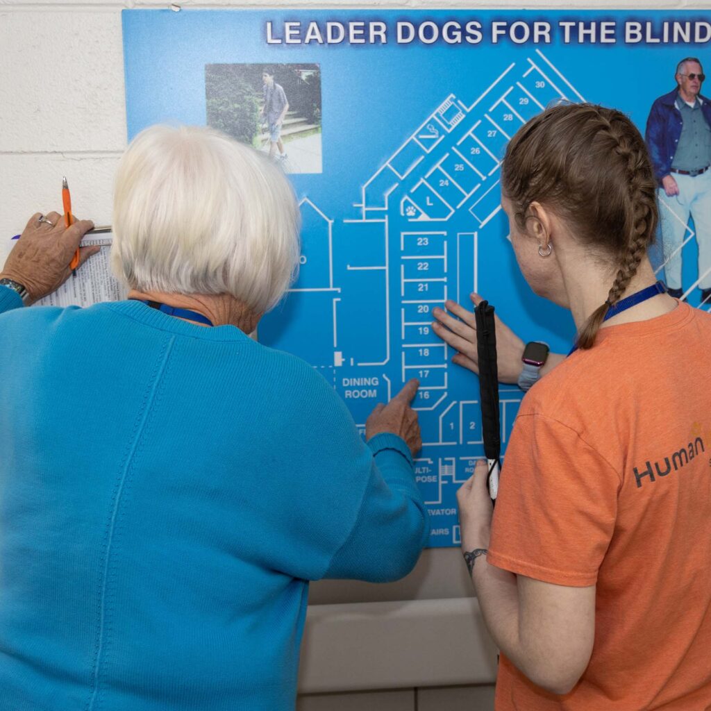
Every third Thursday in May, we come together to recognize Global Accessibility Awareness Day (GAAD) — a day dedicated to bringing light to accessibility and inspiring conversations, thinking and learning about digital access and inclusion.
Why Accessibility Should Matter to You
Accessibility is about more than just compliance — it’s about empathy, equity and designing with everyone in mind. Accessible content also improves the user experience for older adults, people with temporary impairments (like a broken arm) or anyone in a situation where they can’t fully engage with content — like reading in bright sunlight or watching videos without sound.
Making your content accessible opens the door to a wider audience, strengthens your digital presence and builds a more inclusive world.
Key Accessibility Considerations for Digital Content Creators
Whether you’re designing, writing an email or publishing on social media, here are some essential things to keep in mind:
Be Mindful of Capitalization
Screen readers, a tool people with low vision or blindness use to read and navigate digital content audibly or through braille, use changes in tone or inflection to indicate capital letters, helping users understand structure and emphasis in text.
Capitalization is especially important when words aren’t separated by spaces, such as in hashtags, email addresses and URLs. For example, #LeaderDogsForTheBlind is easier to read and understand than #leaderdogsfortheblind, as screen readers can better distinguish the individual words.
Write Descriptive Alt Text
Images should include alternative text that conveys the essential information or purpose of the image. Essential information is key in this. Avoid vague descriptions like “a black puppy” or “photo” — instead, describe what’s important in the image context or label it as decorative only with a space in the alt text box (like this “ “) when it does not convey any meaning.
Alt text is not always visible on a page but is used by screen readers in the coded structure of a platform. If a platform does not allow for the use of alt text, include an image description within the written message to convey the meaning.
Ensure Sufficient Color Contrast
Low contrast between text and background makes content hard to read, especially for users with low vision. There are many free tools online, like WebAIM Contrast Checker, that can assess color contrast in any design for accessibility.
Make Links Descriptive
Avoid vague link text like “click here” or “read more.” Instead, use descriptive phrases that tell users where the link will take them — like “Visit the Leader Dogs for the Blind website.”
Provide Captions and Transcripts
Videos should include captions for people who are deaf or hard of hearing, and audio content should be accompanied by transcripts. This also benefits users in noisy or quiet environments.
Include video descriptions to explain the meaning communicated visually. In most cases this is best done throughout the video, describing graphics or demonstrations.
Become a Leader
Accessibility in technology is always changing and there are notable improvements for inclusivity, making accessibility easier for both content creators and users. What can we do to help this growth and invite more people with different abilities to our communities and conversations? Stay empathetic when publishing content, sending communication and in conversation.
Don’t be afraid to try new ways to make content accessible, it is okay to fail and to tweak as you learn. It is important to take opportunities to consult with people that belong to the communities you are reaching and listen to their feedback and needs.
Ready to Learn, Support, or Make a Difference?
-
Apply to a Program
Learn the skills for safe, independent travel and lead a life without limits — all at no cost.
-
Donate
Since we receive zero government funding or insurance money, we rely 100% on the generosity of donors like you.
-
Volunteer
Every day, we rely on the support from our community of volunteers, made up of people just like you who make our mission possible.
Join Us For Bark and Brew 5K!
Presented by Chief Financial Credit Union - June 7, 2026
Kick off your summer with a fun and scenic run through Downtown Rochester, MI. All proceeds from the Bark & Brew 5K directly support Leader Dog’s life‑changing programs and services, provided at no cost to people who are blind or have low vision.
In-person participants receive a race t-shirt, large medal, race bib, and a coupon for a free, age-appropriate beverage and food item at the post-race party.
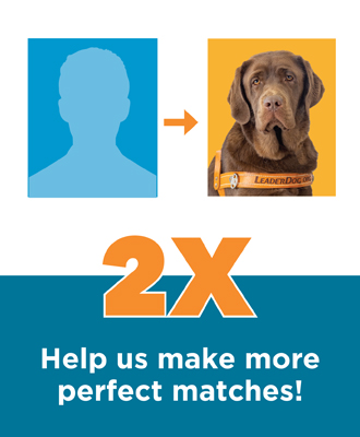
LAST CHANCE to take advantage of our Matching Gift Challenge
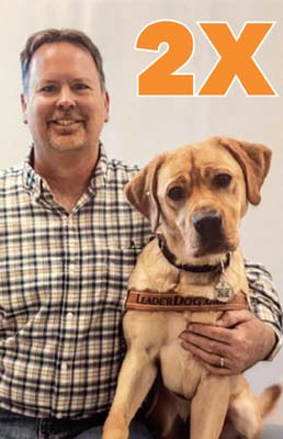
Support our $60,000 Matching Gift Challenge and have your gift DOUBLED!
Join Us For Dinner in the Dark!
Presented by AAA The Auto Club Group - March 20, 2026
Our signature fundraiser will take place at the Palazzo Grande in Shelby Township, MI. Every dollar raised supports life-changing programs at no cost to our clients, empowering people who are blind or low vision to live independent, confident lives.
The evening includes a family style dinner, an open bar, hors d'oeuvres, an ice cream and cannoli platter, an espresso station, and on-location parking.

A New Issue of the Faithful Friends Newsletter Is Out!
In our latest Faithful Friends newsletter, we highlight ways we are helping Leader Dog clients — and we invite you to learn how you can make a difference.